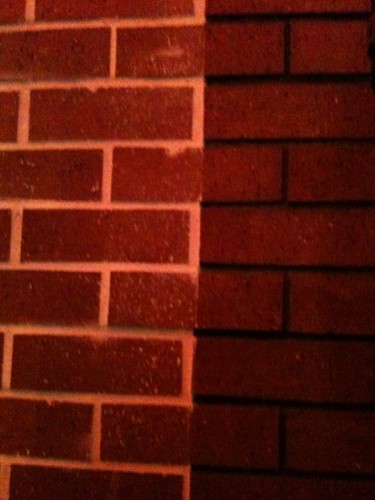
Abolish Fullerton’s RDRC!

In the post about brick veneer stuck on to the side of the proposed parking structure on Santa Fe (here), admin added a helpful comment that shared the minutes of the Redevelopment Design Review Committee (RDRC) meeting when the parking structure was considered by the committee. Although the members of the committee quibbled with this or that detail of the structure, none of them opposed or even questioned the project architects idiotic statement that the fake brick was there to “relate to” buildings on Harbor. One of the members even proposed the thin-set type of brick to save money
While we have to wonder if the architect had been coached beforehand by staff to pay homage to Fullerton’s obsession with brick veneer, the main point of this post is to ask why nobody on this hapless committee even bothered to question the comical notion that a concrete parking structure needed a fake veneer in order to relate to other fake brick veneer buildings in downtown Fullerton.
And so we repeat our challenge to Fullerton: ABOLISH THE RDRC!
Update: We have received word from an RDRC member that the committe was told that brick veneer was necessary as a CEQA mitigation for a Negative Declaration; that, in effect, the brick veneer would make the building compatible with other brick buildings in downtown Fullerton.
Just as we suspected. This “mitigation” is simply staff’s way of getting what they want: brick veneer. There is absolutely no need to “mitigate” a non-existent problem. If we can believe the RDRC member this was simply a matter of personal aesthetic taste – and poor taste at that.
What is the source of this red brick obsession? How many historical buildings in Fullerton actually made out of real red brick? I can only think of a few.
You are right. And many of the real brick buildings have been stucco’d over or sandblasted.
Thanks for the update. I, too, suspected that the City staff was behind this poor choice of materials. You are right about the CEQA point, too. I have often seen government agencies talk around mitigations when they really wanted to do something. Here they were using the mitigation as a pretext to use the brick because they really think this crap “fits in.”
I took a virtual drive through downtown Fullerton on Google Earth. There are far more non-historical/fake brick buildings than real. Why do we try so hard to hide our city’s true heritage in a haystack of faux crap?
We should let the real city treasures stand out and let talented architects build a new generation of buildings that the next generations may find worthy of preserving.
This blog has opened my eyes. Thank you.
Why does everything have to fit in w/downtown Fullerton?
Great downtowns have buildings made of a variety of materials, finishes, shapes, styles.. Think Chicago, Monadnock Building (1st skyscraper, brick), Xerox (glass, wrapped w/stainless veneer), State of Illinois Bldg (wild orange, blue steel w/Louise Nevelson sculpture), Chase Bank (stone/concrete w/fab Chagall mural wall), City Hall (black glass, steel?, green, planted roof, Calder sculpture)…
Downtown Fullerton is an eyesore. There is no flow, creativity.. Just a bunch of badly conceived new buildings, badly preserved old buildings. Charming, asethetically pleasing, NOT!
#5 you are soooooo right.
The slavish attachment to fake old is a function of Fullerton’s lower-middle brow bureuacratic penchant for playing it safe, and doing it in the most banal manner.
A quick look around Fullerton quickly reveals that the most interesting buildings – many of them private or commercial structures – were built in the late 1950s, early 1960s. After that something went terribly wrong with the City’s level of aesthetic appreciation. What was it? The homogenizing effect of Redevelopment surely added to the malaise; but there must have been something else at work that contributed to the collapse of the sinkhole.
Anonymous, great comment. Here’s what Downtown Fullerton has become; thanks to redevelopment loans: