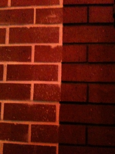
The Curse of Brick Veneer
One of the biggest selling points of Redevelopment is that it’s supposed to make things look better. Especially buildings. As its legal justification, Redevelopment is supposed to eradicate blight. In Fullerton most of what Redevelopment coughs up seems to look more and more like blight every time we look at it.
Our pages have been strewn with examples of cheap, crappy, banal, and cheesy buildings underwritten by Redevelopment, whose design has been guided by the shaky hand of Redevelopment bureaucrats who have micro-managed downtown Fullerton into an open air museum of aesthetic horrors.
But today, let’s focus on one our biggest pet peeves: Redevelopment’s penchant for brick veneer – one of an angry God’s most certain punishments visited upon humankind.

The “Trider Building” on the SW corner of Pomona and Commonwealth showcases the cheapest of all the brick veneers – what the professional masons call “lick and stick.” This crap was applied to a black mastic background and began to pop off almost immediately. Recently somebody was employed to fill in the joints with mortar, presumably to arrest the pop-off effect, but they only got a few feet off the ground before they stopped. The result looks even worse than ever except that at least now there is an undeniable comic effect not calculated in the original design.

Here’s an example where a grouted veneer runs headlong into what appears to be another lick-and-stick. Neither one looks good. Juxtaposed the effect of cheapness is intensified.
For years the Redevelopment and Development Services Departments not only tolerated, but actually foisted brick veneer on the rest of us – presumably because old buildings are made of brick and brick veneer is made of brick, and Fullerton is all about preserving old things. The whole idea of regurgitating old building themes in fake materials was, and still is, the order of the day. And so the idea of original and creative design has been intentionally jettisoned for the architectural garbage that litters downtown Fullerton.
Coming up soon: The Horrors of Styrofoam.
In the spirit of deficient materials, I would have used toothpaste instead of mortar.
Nevertheless, this is indeed plaque-worthy.
One can only wonder if Frank Lloyd Crane had his talented hand in this design. A town with a fake architectural review board, with fake planners and the design guidance of the firm Galvan, Crane & Linnell results in such buildings. Or perhaps a certain ex-plastic surgeon, who knows beauty, supported this design?
Deception is a crime in my books. Fooling people into believing a building is brick when it’s not is sinful.
the brick veneer is a metaphor for some of fullerton’s council members. Under scrutiny, the brick is a facade. Under scrutiny, some council members speeches and actions are a facade that barely covers their greed for power and money.
I know this won’t be a popular thing to say on this board, but I like the brick look. It gives the downtown a nice historical look and feel. You may like modern architecture which is faddish, but brick is here to stay.
The fact that you can have the brick look without all the brick is good. Who wants a brick building falling dopwn on them during an earthquake!
Yes Chamber Star, we know you like fake brick. Your headquarters is covered with it too.
Chamber Star likes fake brick because he likes “lick and stick” things.
The Wilshire Promenade was a redevelopment project, and is already falling apart:
Let’s hope that didn’t hit anybody on the head as it came down.
Admin, that photo speaks volumes! Not only does it exhibit cheap, crappy work, but it drives the point home that ALL THESE BRICKS ARE FAKE! Who does the RDA think they’re kidding?
Dishonest, disgraceful, dumb, disingenuous, deceitful, and dangerous!
City Council, no more brick veneer, please!
BTW, maybe the Redevelopment Agency can subsidize hardhats to downtown visitors to help protect them against the blight.
RDA Hardhats. Think of the branding opportunity…
I am waiting for the next big earthquake to hit just to see all of that crap peel off. I myself do not prefer the yuppish modern building. However, this stupid fake facade that has plague the city is tacky and an obvious forgery of the real thing!!!
Actually this photo makes you wonder what kinds of mechanical attachments were used to keep the brick on the building. It’s hard to see any tabs in this image.
Free advice: walk along the south side of Wilshire if you are in the vicinity.
u meen i shuld hav wor a harhat walkin on willshir? i got hit bi 1 of them fake brikz/
My mistress used to have an office in this building. She was a big Redevelopment cheerleader. It would be very ironic if she got clunked by one of these blighted bricks. But let’s hope not! I’m not that vindictive!