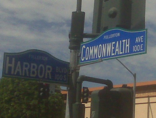
New Street Signs: Assessing the Hump
The first thing that came to my mind when I first saw these street signs was: am I the only one that thinks these things look like something I might find at Knotts Berry Farm or the dopey French Quarter at Disneyland?
There is something odd about the idea that a street sign needs to be treated as an “aesthetic” object – meaning that it is subject to the whims of visual preference among some class of people self-appointed to pass judgement on such things. A street sign is a street sign. The first necessity is functionality. Can it be read easily, and read at night? Is is affordable? After all, the taxpayer is footing the bill, rarely the individual who makes the “design” choice.
But there is something more subtle and just as pernicious as mistaking a utilitarian object for an artistic one. And that is the application of boneheaded and embarrassing aesthetic choices. We have already illustrated the confused thinking behind the aesthetic viewpoint that prefers the curved to the straight line, the complicated over the simple. Remember this post on Fullerton’s goofy redevelopment sidewalks?
And in our numerous posts that have railed against fake old we have also criticized the bureaucratic bad taste that adores the hideous old-timey themes so prevalent in insecure places like Fullerton. Who knows why there is a hump on the top of these signs? Is it something someone saw somewhere? Something picked at random out of a street sign catalogue by a traffic engineer? Are we supposed to discern an echo of the Mission Revival espadana in the hump – like those disgusting Taco Bell outlets of the 80s? Who cares?
This is just another example of confusion: confusion that a street sign needs to be gussied up; confusion that a hump on top is better than a simple rectangle; and confusion that the inclusion of the almost illegibly dinky word “Fullerton” somehow adds something to the ensemble.
Say, whatever happened to that Country Bear Jamboree?

You definitely have way to much time on your hands…………….
Nope. It took me about three minutes to write this post. Very quick. Of course the City makes it so easy. Always lots of good material.
The new street signs are an insult to the intelligent people who live and work in downtown.
THE EXPERIMENT FAILED.
FULLERTON IS SUPPOSE TO BE THE EDUCATION COMMUNITY
THE SIGNS ARE HIGH SCHOOLISH & FOOLISH
THEY BELONG IN DOWNTOWN DISNEY
TAKE THEM DOWN.
They are clean and very easy to read, thats what you want out of a sign.
They are not “clean.” They are humped.
And you can’t read “Fullerton” at all. Especially at night. So what’s the point of that?
You know your in Fullerton, very few cities have name of city on there signs, Art major go back to schoolish you are being foolish.
Thanks for proving my point, dimwit. If you know you’re in Fullerton, why do the signs have to say Fullerton at all, and why in tiny little letters nobody can read?
I’m with FLY on this one. Those signs evoke memories of olde time Fullerton, a history that is precious to all of us.
Using the name Fullerton is important, even if you can’t read it too well because it creates an advertising “branding” scenario and it creates a real feeling of pride for Fullertonians as they know they part of something bigger than just themselves. Good job City!
Look forward!
FYI: Ferrero went to jail. He got caught his hands in the redevelopment cookie jar, caveat emptor.
Is fake old the same as crappy quaint? fullerton’s new quaint street signs support my long ago observation that this town is full of provincial liberals who just love to protest the establishment, man, by inserting humped signs into our town.
Fake old and new quaint are indeed the same thing.
And now that I come to think of it, fake quaint would be parody, which almost nobody would get.
Could Buena Park’s Metrolink Station be fake quaint? That could be. But somehow I doubt it.
If you check the catalog for municipal street signs this type of sign design is all you will find. The trend is to look like the old days. Just like they want you to live close to work and retail so you won’t drive. If you want to see bad legislation check out SB 375 and AB 32. Social engineering.
Art, welcome to the blog!
You must be joking, I find it impossible that a sign company that makes street signs does not make a rectangular street sign, hmm…
They make rectangular signs. They just don’t push them and put the others up front and have nice photos.
Gives a whole new meaning to Hump Day.
Looks like and seems like someone has a friend,relative,underemployed son- in-law, “significant other” who needed the money and got the contract.
All in all I hate humps they belong on camels.