THE DISMAL DRIVE TO ARCHITECTURAL DREARINESS @ FJC
A couple of years ago I sent the following letter to the Fullerton Observer. It caused a bit of a stir among the knee-jerk educrat supporters. I hope you Friends enjoy it, too:

Dear Editor: There is an old adage that bad architecture costs just as much as good. This lesson seems to be lost on the educators over at the NCCCD. First they erect the god-awful monstrosity of the library with its overbearing size and fake historical details, right down to the false concrete formwork impressions on lath and plaster walls!
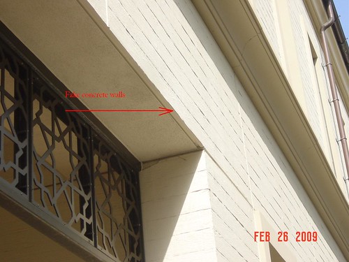
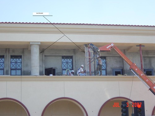
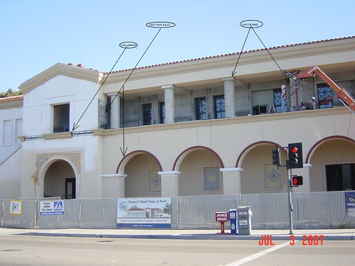
And now the Student Commons: another McSpanish dinosaur looming over innocent passersby on Chapman Avenue. With its fake “thick” walls, fake concrete columns, fake cornices, and oafish arches (see attached images) this edifice represents all that’s bad in trying to ape the design of the poured-in-place concrete structures on campus.
Had the college pursued a course of promoting original modern design they may well have succeeded in erecting buildings that would be recognized 70 years from now as historic. – buildings that were graceful, elegant, efficient, and that honestly expressed structure in form. My guess is that the WPA buildings on campus will end up outlasting these new ones.
The promotion of fake old architecture by our Board, on the other hand, is the result of confused thinking. The idea of emulating existing building’s themes so that the new ones “fit in” is meant to display aesthetic sensitivity with a nod to the ideas of tradition and preservation – concepts that they badly misunderstand. Fake old architecture honors nothing, least of all the past. The feeble attempts to copy historical detailing that present-day workers can’t do, or that the College won’t pay for, pays homage to nothing. Placing a fake old building next to an historic building will serve to make the original look better, but how much more of an honor would it be to hire a creative designer and let him or her pay tribute to the existing built environment through the exercise of creativity and talent! Isn’t that the lesson our public schools should be teaching their students?
Yes, that building is garbage. Timid people commission timid architecture, and timid people have no place in education. Pritzger Prize winner Thom Mayne produced a stunning design for a high school in Diamond Bar:
http://www.GreatBuildings.com/buildings/Diamond_Ranch_High_School.html
http://www.architectureweek.com/2000/0607/index.html
He didn’t spend any more money on it than a dull building would have cost. Like or not, Mayne let the students know that someone cares enough about them to try something new and exciting instead of boring them to death.
Is there some reason our city’s downtown should bore us instead of exciting us every day? No wonder we cling to what’s left of the old buildings. At least they have achieved the charm of age–something the new structures at Fullerton College will never do.
That is brilliant.
Some people might say that the architecture reflects the intellectual scope of the faculty, student body and administrators! Not to mention the Board of Trustees. isn’t Molly McClanahan still on that?
Joe: sadly, those people are undoubtedly correct. Architecture is all too likely to reflect the intelligence and taste of the administration that produces it. But that misses the point. The point here is that an academic institution, even a public one, should be striving for artistic integrity not the phoney crap they are throwing up over at FJC.
“Is there some reason our city’s downtown should bore us instead of exciting us every day?”. Matt “bore” is a stretch, “disgust” is more like it.
Government does not design well. Hell, look at how most of them dress let alone DESIGN! I’m disappointed with the design as well. Not to mention the lack of setbacks. It would have been cool to have some inviting congregation spaces or large sidewalks on Chapman. FAIL.
Or an even WORSE example of government design is Garden Grove’s digital signs. What!!! Are we in the 80’s again?? I haven’t seen design like this since I went to Edwards movie theaters back in the 90s. FAIL, again!
http://www.ci.garden-grove.ca.us/?q=pw/AmberAlertSigns
Finally saw Garden Grove’s new digital signs up close. The only thing I can say about them is that they are not quite as ugly as that godawful clock tower near their “downtown”.