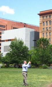
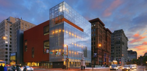
Last month I was walking Independence Mall in Philadelphia and admiring the history and reflecting on what it would have been like in 1776. As I crossed Market Street to go look at the Liberty Bell I looked left and right scanning the streets. Then something caught my eye. The antique cityscape had something shiny and new nestled in between two pieces of historic-looking buildings.
The structure has jutting polished metal forming right angles and contrasts sharply against the backdrop of American history. The building’s unusual placement on the historic Mall speaks volumes of its purpose, though no billboards announce what that may be.
As I circle the Mall admiring the formation of our Country, my mind and camera wander back to the building, now more striking than when I saw it just moments ago. Seeing the building on the Mall and recognizing the unusual beauty of its presence in that location has caused me to question the direction the City of Fullerton has traveled for decades.
A recent FFFF post brought to light the Redevelopment Design Review Committee’s selections of less than inspiring architecture.
I used to have the strong opinion that modern designs just would not work in our downtown. After long debates and discussions with friends and my visit to Philadelphia I am confident that it can work well.
Entrepreneurs looking to raise the bar and make their place in Fullerton should look to innovative designs which will stand in contrast to our old and confused architecture. More importantly, when every other building is a bar or tattoo parlor, business owners need to look at ways of setting their establishment apart from the rest of the herd.
