ABOLISH THE RDRC!

Update from admin: It’s 2011 and we’re still still catching stanky wiffs rising from the bog of mediocrity known as the RDRC. Yep, they’re still slowing and stalling residential additions,  nitpicking the architectural details of private projects and using the know-nothing force of government to bear down on hapless homeowners trying to improve buildings that aren’t even visible from the public street. And so again we say…

The Fullerton Redevelopment Design Review Committee (RDRC) must be abolished. The committee was created in the 1970’s along with the Redevelopment Project Areas with the goal of fostering good architectural designs within them.

The trial run period is over. The RDRC and its associated bureaucratic process has failed – failed to improve design in either the project areas themselves, or in the ever growing number of projects in which city staff has required RDRC review. Actually the reverse is true. The failure has been spectacular.
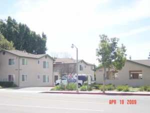
who says affordable housing has to look ugly?
Who says affordable housing has to look good?

The pages of this blog has been nauseatingly filled with examples of RDRC failure-projects dutifully approved by a compliant and complacent RDRC. Rather than promoting innovative and creative work-excellence, in fact, the RDRC has enabled city staff penchant for the phony, stucco, and brick veneered banalities intended to comfort the worst of middle brow aesthetic preferences.

hc1

Over the weary years the RDRC has been the precinct of local architects looking to promote their own interests within the city. Numerous examples of conflicts of interest were exposed in the 1990’s. And the city council keeps appointing to the RDRC dingbats, talent-free Pecksniffs, and interior decorators, to whom you wouldn’t entrust the design of a birdhouse. The existence of this committee provides the city council with a little political cover on potentially controversial projects, but accomplishes very little else.

it didn't look so bad on paper

And so we say: Abolish the RDRC! People developing their own property without subsidy or without legislative action by the City should be able to design their projects without city oversight; those receiving subsidy or significant zone changes should be required to use architects who have been published in reputable professional journals. Maybe when this happens we can have increased freedom for private owners and design excellence for City sponsored projects. Presently we have very little of either.
Ground Zero of Fullerton Redevelopment Failure

For dyed-in-the-wool government apologists like Dick Jones, Jan Flory, Dick Ackerman, Sharon Kennedy, Don Bankhead, et al., Redevelopment blunders are conveniently overlooked, when possible; when not possible, some lame defense is mounted, such as: mistakes were made (passive voice obligatory) but we learned and moved on; hindsight is 20/20 (Molly McClanahan’s motto vivendi); the problem was not too much Redevelopment, but too little!

But when any reasonable person contemplates the collection of Redevelopment disasters along Harbor Blvd. between Valencia Drive and the old Union Pacific overpass, the only conclusion he or she could draw is that the Fullerton Redevelopment Agency should have been shuttered years ago, and the perpetrators of the manifest failures crowded onto a small raft and set adrift with the Japanese Current.

We have already described in nauseating detail the “Paseo Park” debacle; and the Allen Hotel fiasco; we haven’t yet had time to talk about the “El Sombrero” pocket park give away (we will).

But instead of wasting too many perfectly good words, we will share with you Friends a Redevelopment pictorial essay with just a little piquant commentary.

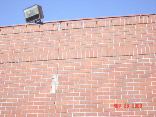
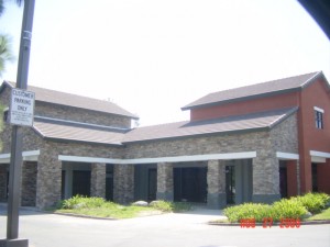
First there’s the strip center known as Gregg’s Plaza. Brick veneer, of course. Even the veneer is so disgusted it’s trying to jump off the building.

The standards of the RDRC were established early.
Pop goes the brick veneer...

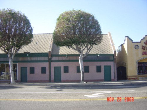
Across the street is the Allen Furniture Store. When they got their rehab loan somebody forgot to tell them that a storefront is a storefront – not a jailhouse. So why are there bars on the dinky little windows? And pink stucco?

Stone walls do not a prison make; nor iron bars a cage...

Jumping back across the street we re-introduce ourselves to the egregious Allen Hotel, perhaps the biggest Redevelopment boondoggle of all, a mess that we have already admirably documented, here. As we noted then, the add-on was unspeakably awful (and expensive). The front is, well, pretty awful, too.

The once and present tenement...
It could have been worse. Well, no, it couldn't...

What was sold, in part, as an “historic preservation” project ended up violating just about every standard in the book. The original windows were ripped out and replaced with vinyl sashes; the transoms were destroyed and replaced with sheets of plastic and surface applied strips supposed to simulate leaded glass.

Just say something. They'll believe anything...

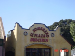
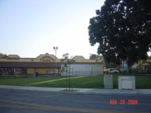
Across Harbor we discover the “El Sombrero Plaza,” another sock in the face to any Fullerton windshield tourist. Forget the stupidity of the sideways orientation and the Mission Revival On Acid stylings (which attain a kind of crazy Mariachi deliciousness); this development included the give away of part the adjacent public green space so they have parking for a restaurant. The owner never did develop a restaurant, of course (more on that story later).

Ay, caramba!
Ay, caramba!
The extra parking that was supposed to be for a restaurant is now used for a storage container!

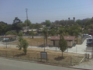
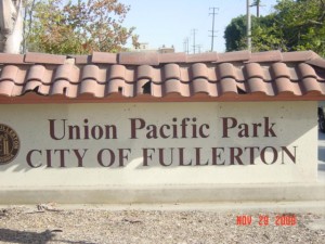
And finally we come to exhausted collapse at another one of the Fullerton Redevelopment Agency’s low points. And by low point we mean the complete, unmitigated disaster of the Union Pacific Park, ably chronicled here; and in a whole series here, here, and here.

Maybe the less said, the better...

The poisoned park: dead as a doornail. An aesthetic, pratical, and policy disaster. And no one has ever stood up to take responsibility for the total waste of millions of dollars.

Embarrassing from the beginning. How many $100,000 pensioneers had their fingers in this pie?
Embarrassing from the beginning. How many $100,000 pensioners had their fingers in this pie?

Well, there you have it, Friends. Redevelopment in action; Redevelopment creating blight, not eradicating it. No accountability. None. Zero. Zilch. And some people wonder why FFFF has sued to keep Redevelopment from expanding.

Downtown Fullerton: The Brick Myth, The Reality of Brick Veneer, and The Legacy of Schlock

We published a couple of posts a few days ago on the new parking structure planned on Santa Fe Avenue, and how it is proposed to be faced with brick veneer here and here .

You may remember that I got to thinking about why the city staff would tell the RDRC that the $40,000,000 parking structure must have brick veneer; and that I asked one of the RDRC Board members that very same question, and the answer I got was that staff told the Committee that the City has to use brick veneer because it was a “State” requirement to meet the CEQA guidelines. (I also noted that the use of fake brick is in complete contrast to the sustainable design the General Plan Advisory Committee has spend the last 3 years discussing and recommending to the City Council).

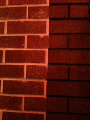
CEQA? Yes CEQA he said, because there’s a provision in the CEQA guidelines that requires mitigation of any visual impacts. In other words, since the new parking structure was being built with structural concrete, and the surrounding downtown has many brick-looking buildings, using the brick veneer would cause no visual impact on the environment. I say “brick-looking” because so many of the buildings in downtown Fullerton are faced with fake brick veneers, facades that are not historic, and some of which, in fact, were stuck-on older buildings during the course of Redevelopment in the last 30 years. And many of these were subsidized by the taxpayers of Fullerton.

How do I know this? I did a building facade survey of downtown from the RR tracks to Chapman and from Malden to Pomona. I documented the principal “building skin” of each structure. The results didn’t surprise me, but they may surprise you; they should shock the Redevelopment and Planning Department “experts” who not only have been tolerating, but actually promoting this material over the years – seemingly in an effort to keep downtown “historical” looking. Boy, did they get it wrong.

Here are the results of the survey:

24 Brick veneer

2 Flagstone veneer

9 Real brick & clay block

3 Glazed & fluted brick

24 stucco & plaster

20 Concrete, concrete block & terra cotta

And here is a useful overhead image with the various exterior materials colored in on each of the building’s footprint. Notice how few real brick buildings there are; and of these only a couple are red brick – the crap of choice among Fullerton’s bureaucratic tastemakers. The buildings with substantial brick venerers are pink.

Downtown Fullerton

Using CEQA to bolster the poor design choices of the past is pretty bad. Let’s hope this post will help end the travesty of bad and cheap looking architecture based on erroneous assumptions, and that California’s environmental laws will never be used again by city staff to foist this garbage on us.

Abolish Fullerton’s RDRC!

Some folks say brick veneer is a perfect symbol of the RDRC...

In the post about brick veneer stuck on to the side of the proposed parking structure on Santa Fe (here), admin added a helpful comment that shared the minutes of the Redevelopment Design Review Committee (RDRC) meeting when the parking structure was considered by the committee. Although the members of the committee quibbled with this or that detail of the structure, none of them opposed or even questioned the project architects idiotic statement that the fake brick was there to “relate to” buildings on Harbor. One of the members even proposed the thin-set type of brick to save money

While we have to wonder if the architect had been coached beforehand by staff to pay homage to Fullerton’s obsession with brick veneer, the main point of this post is to ask why nobody on this hapless committee even bothered to question the comical notion that a concrete parking structure needed a fake veneer in order to relate to other fake brick veneer buildings in downtown Fullerton.

And so we repeat our challenge to Fullerton: ABOLISH THE RDRC!

Update: We have received word from an RDRC member that the committe was told that brick veneer was necessary as a CEQA mitigation for a Negative Declaration; that, in effect, the brick veneer would make the building compatible with other brick buildings in downtown Fullerton.

Just as we suspected. This “mitigation” is simply staff’s way of getting what they want: brick veneer. There is absolutely no need to “mitigate” a non-existent problem. If we can believe the RDRC member this was simply a matter of personal aesthetic taste – and poor taste at that. 

The RDRC and Jay Eastman Take A Curtain Call

DSC00132

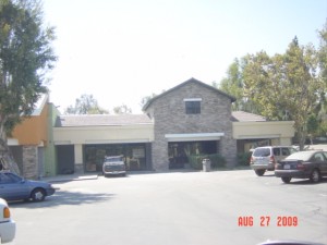
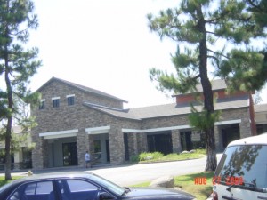
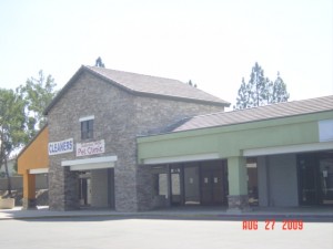
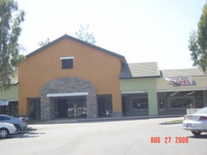
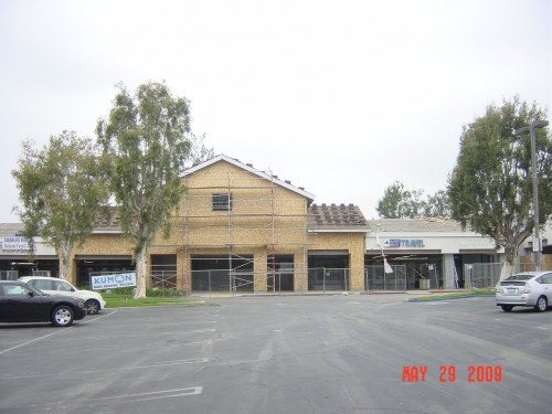
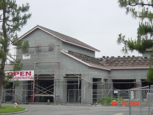
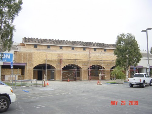
Don’t say we didn’t warn you. Because we did. In previous posts  here and here, we tracked the progress (if you really want to use that word) of the strip center at Euclid and Rosecrans. Well, the scaffolding has come down and what’s revealed ain’t purty.

Our theme here was wasted space and building materials and of course, The City’s dubious commitment to the idea of sustainability. And our purpose was not to dwell upon the poor aesthetic choices made by the owner of this center. Instead we chose to focus on the City’s role in this aesthetic disaster. For some reason the Development Services Department (they serve developers) decided that this non-subsidized, private remodel needed to go to the hapless Redevelopment Design Review Committee – even though it is miles from a Redevelopment area.

Planner Jay Eastman made it clear that the RDRC intended to impress its preferences unto this site – no doubt assisted by Mr. Eastman himself. Let’s let Barbara Giasone help us with our narrative from a May1, 2008 story:

“The proposed remodel was reviewed by the Redevelopment Design Review Committee last week, but the panel felt the design was commonplace and didn’t reflect the character of the neighborhood, Acting Chief Planner Jay Eastman said. The architect was asked to look at the surrounding neighborhood with terms like “country,” “rural” and “equestrian,” Eastman added.”

Country. Rural. Equestrian. Got it?

The ensuing visual train wreck of disjointed parts, shed and gable roofs, the weird confusion of masonry veneer and stucco, and all the wasted attic space with its dinky windows provide a suitable denouement, fifteen months later,  for this cautionary tale. If the property owner had been left to his own devices it is hard to conceive anything worse being done – and it could have been done a lot less expensively.

We wonder just what sort of idiots our staff and their RDRC think inhabit rural equestrian areas.

DSC00135

DSC00129DSC00144

DSC00130DSC00141

Fullerton Redevelopment History, The Gift That Keeps on Giving; The North Platform Fiasco – Introduction & Allegro

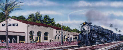
Before Redevelopment got a hold of it...

A few months ago when we were running our award eligible series on the manifold history of Fullerton Redevelopment boondogglery, we promised our Friends that we would relate the biggest mess of the whole kit and caboodle. We have been a bit dilatory about this and so we apologize for being remiss. But now the time has come to tell the tale of The Great North Platform Disaster.

Way back in late 1992 and early 1993 the Fullerton Redevelopment Agency, under the management of Terry Galvin and the direction of brand spanking new Director Gary Chalupsky, began construction on the north platform at the Santa Fe train depot. The work was “designed” by one Steve Rose, a well-connected local landscape architect, and was intended to “improve” the platform area for the increasing number of train commuters. The design passed through the process of staff review by Galvin as well as the scrutiny of the Fullerton Redevelopment Design Review Committee. The budget for construction was in the neighborhood of a million bucks.

The project was bid, the contract was awarded. But as construction proceeded it became very apparent that something had gone wrong. Terribly, terribly wrong.

Rosecrans/Euclid Project Update


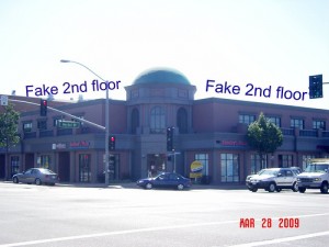
Does RDRC like fake 2nd floors?
The RDRC likes fake 2nd floors.

A few months ago we posted  on the remodeling underway at the Rosecrans/Euclid shopping center. We shared information that a city planner had insinuated himself into the design process; we opined that government and good design rarely mix; and we promised periodic visual updates.


Is that a caretakers unit above retail?

On that last point we have been remiss, and so we now share some images. They don’t seem to have made a lot of progress, but as you can see all that wasted space has been wrapped in lath and stuccoed – all wasted materials, too.


Are those multi-units above retail, or, perhaps mixed use?
Are those multi-units above retail, or, perhaps it's a mixed use project? We will soon find out.

Design Review Member Steve Lynch on Jefferson Commons

Stucco, Styrofoam, and lots of it
Stucco, styrofoam, but where's the parking structure?

Greetings Everyone-

I would like to apologize to you for the manner in which I left the meeting last night. I wish I could fabricate a better reason than being absolutely disgusted with JPI Development for their thinly veiled deception of the RDRC and Staff…but I can’t. I felt my blood pressure elevating and thought it was best for me to leave before making any more comments regarding their six shades of shadiness. As you may have guessed by now I believe the JPI group deliberately misrepresented the mass of the parking structure in the colored elevation drawing that they presented to us at the RDRC meeting in which they earned our approval. I also believe it was a calculated move for them to casually slip the actual scale of the structure into the elevations in the construction drawings and hope nobody caught it. If I am not mistaken Heather caught this little “revision” and that is why they were a last minute addition to our agenda last night. If I had to do it over again I would have dug my heels in and tried to sway the other members towards my belief that what JPI presented last night was significantly different than what was approved, however, I felt at the time that would have been futile as the other members didn’t seem too affected by the change. Perhaps in the grand scheme of things none of this is going to make any difference to anybody and the building will get built and the citizens of Fullerton will be none the wiser to what the building should have looked like, but I know, and the sense of satisfaction I once felt for having collaborated on this project is now a bit corrupted. When the minutes are being drafted for last nights meeting I would like the record to reflect my true feelings as accurately as possible.

Jay/ Heather…if it’s not in violation of any policy, I would like this email shared with the other members of the committee.

Regards,

Steve Lynch

Last October, this letter was sent to the Fullerton Observer, but NEVER got published.

Demo update
Demo update